How data visualization solutions can increase your data sharing

When it comes to data visualization, what solutions are available to enterprises and public sector organizations? Do they really allow us to leverage data and make data-driven decisions and build truly data-centric organizations?
Social media, business applications, IoT connected devices, spreadsheets and feedback surveys are just some of the thousands of data points that organizations today collect from an increasing range of sources. That means that to enable each piece of data to be used to identify opportunities or risks, it must be accessible, consistently formatted and made understandable and shareable to support analysis and reporting.
That’s where data visualization comes in. By transforming raw data into easy-to-analyze visual representations, data visualization (or data viz)solutions enable organizations to make better decisions. When it comes to data visualization, what solutions are available to enterprises and public sector organizations? Do they really allow us to leverage data and make data-driven decisions and build truly data-centric organizations?
Data visualization: make your data talk!
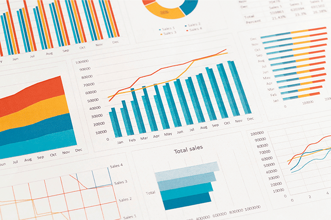
Data visualization translates raw data into understandable visual representations. There are different types of visualizations (diagrams, maps, rankings, graphs, timelines, etc.) that can be used, depending on the format that best suits the information to be communicated:
- For geographic data: choose a map.
- To represent changes over time: choose timelines or diagrams.
- To compare information: graphs are most effective (whether in the form of bars, stacked bars, lines, sectors, etc.).
- To show a ranking: ordered column, ordered bar or parallel column charts are most relevant.
- To show the distribution of your dataset: box plots, histograms, density plots or even violin plots are best.
- To highlight a correlation: choose heatmaps, scatter plots, column and line plots, or bubble plots.
Bringing your data visualizations together through dashboards and data stories
Using dashboards and data stories allow you to combine data visualizations on a single page and to analyze them holistically.
Dashboards
A dashboard gathers data generated by the organization and simplifies it through different representations (graphs, maps, ratios, legends, etc.). This makes it easy for anyone to understand the data, whatever their technical skills. Through dashboards, companies can therefore ensure employees can perform in-depth analyses and make more relevant decisions.
Dashboards can be used :
- Internally, for employees at all levels through to senior management, enabling them to monitor activity through different KPIs.
- Externally in an open data format for citizens, or privately with partners or customers.
By sharing data as widely as possible, organizations should encourage the creation of new use cases based on dashboards across the company.
What are the different types of data dashboard?
Depending on their objectives, organizations can create different types of dashboards. Here are the most common ones:
- The reporting dashboard: this is mainly about analyzing a given situation, through performance indicators. Thanks to data dashboards, organizations can make decisions that help them achieve their aims and objectives.
- The management dashboard: to manage the daily operations of the business. They are often enhanced by employees who provide information, and are then used to optimize workflows.
- Communication dashboards: organizations use these dashboards to provide greater transparency and better communication, enabling them to build relationships of trust with their stakeholders and the general public.
Data stories
Data storytelling is about creating stories from data. The aim is to bring context to data to make it easier to understand.
In terms of format, data stories include visual representations of data, but also text, captions and images. Data stories are ideal ways of deepening understanding around a topic thanks to data.
Data visualization to enhance the value of data
All data visualization tools are designed to transform even the most complex data into simple, clear information. And as organizations generate more and more data, these solutions are becoming indispensable. Here’s how you they can be used:
- To identify weak signals: With better data visualization, it’s easier to identify weak signals in the data, spotting potential issues before they cause problems. Dashboards can alert decision makers as soon as certain critical thresholds are crossed, enabling companies to react quickly to solve any problems.
- To motivate teams: as data viz solutions should be understandable by all, employees can easily identify where they can improve their work, monitor project progress or see when objectives have been achieved.
- As a decision-making tool: through performance indicators, organizations can determine which actions need to be completed to achieve their objectives.
- For better communication: by displaying information that everyone can understand, organizations are able to communicate more easily with their employees, customers, prospects, and partners. This makes it possible to create relationships built on transparency and trust.
- The creation of new use cases: dashboards or data stories add value to information. Highlighting this information allows new ideas to emerge and new uses to be created.
How can you make the most of your data visualization?
While dashboards and data stories are essential tools for understanding and communicating data, they do not, on their own, help data analysis or creating new use cases. For data visualizations to be high quality and easy to use, the data must be prepared and enriched. This requires several steps.
Prepare data
If the data used to create your data visualization is wrong, outdated, biased or incomplete, the information conveyed by dashboards or data stories will lack relevance. Worse, it can lead organizations to make bad decisions.
That’s why it is essential to prepare and sort the data before visualizing it. The implementation of data governance is therefore vital. This will ensure the quality, reliability and relevance of your data.
Additionally, well implemented data governance policies ensure that information is easily accessible and identifiable. This enables different datasets to be cross-referenced, enriching data visualizations.
Enrich data
The aim of using data visualizations is to make data understandable. However, to create compelling visual representations, your data should be enriched with other internal and external data. For example, to create a map, you need to combine your data with geographical information.
Make it easy to interact with data
To make interpreting data easier, dashboards must use the right type of data viz (such as columns, lines, pie charts, sectors, or bars) to display and highlight the data effectively.
Above all, it is essential to offer users the ability to easily interact with data through search filters and other discovery options. Whether it is focusing on a set time period, isolating specific data or projecting a future scenario, these are key features if you want everyone to understand and use your data.
Share data
Too often, access to data is restricted to a limited number of people.
For example, within companies, it is mainly developers, IT managers, business analysts and senior management who have access to data. Externally, data sharing is also underutilized. Indeed, only 49% of companies share their data with partners (and 47% with customers).
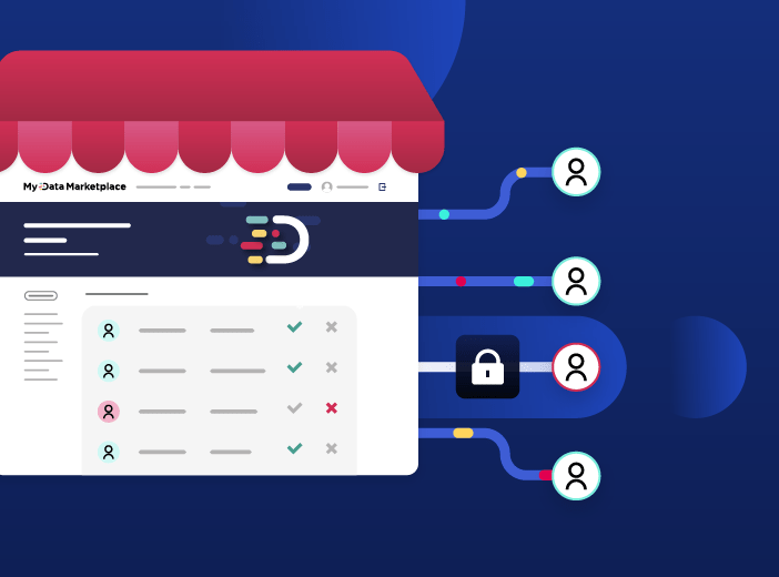
Yet, the more data is shared, the more uses and value you’ll get from it. This is why it is essential to create a single platform to bring together your data visualizations and make them easily accessible to all, based on their jobs and access rights.
Create new uses and share your data with Opendatasoft
Opendatasoft allows all your teams to enhance the value of data, from collection all the way through to sharing by creating relevant, compelling data visualizations.
- Connection to all your data sources through more than 80 connectors to your data tools and business applications.
- Quality control via more than 50 processors, whether for formatting fields, correcting errors, etc.
- Data enrichment through Opendatasoft’s Data hub, which provides 30,000 public datasets to combine with your own sources.
- The creation of data visualizations and interactive dashboards in a few clicks thanks to our no-code studio or via our advanced mode for more complex visualizations.
- Secure sharing of your dashboards thanks to permissions management and easy ways to provide data for all stakeholders.
Get inspired by our customers’ data visualizations
Opendatasoft supports over 350 public and private organizations in all sectors worldwide. Thanks to our platform, our customers can easily share their data through data visualizations. For example:
- The open data portal of the French National Health Insurance agency (CNAM) allows quick identification of reimbursed expenses for different medical conditions. CNAM has set up several dashboards to filter this information and make it easily available.
- Akajoule uses the Opendatasoft solution to provide dashboards alongside the studies it delivers to its customers. These can be local authorities looking to create climate plans, or private companies wishing to analyze the energy costs of their buildings.
- Birdz by Veolia creates dashboards to analyze data from its IoT sensors. The data is updated in real-time with an alerting system.
- EDF’s dashboard allows users to visualize its progress against each of its CSR commitments. The dashboard is an ideal format for getting this type of data out of PDF documents and communicating it transparently.
Through these different visualizations, our clients reinforce the use of data to maximize its value through the sharing.

It can be hard to understand exactly what a data product is, given the many ways that the term is defined and applied. To provide clarity this article provides a business-focused definition of a data product, centered on how it makes data accessible and usable by the wider organization, while creating long-term business value.


